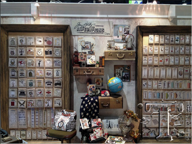
hello everyone! i want to announce that since i had this week planned with show recaps and giveaways, i am postponing the august tag to saturday 8/3. today is all about my launch with sizzix alterations and wait until you see the amazing inspiration this booth had. first i need to acknowledge and thank the true talent behind the booth build and displays – marty and debi from sizzix. these two knocked it out of the park when i shared my creative visions months ago on how i wanted my displays to look and be themed this show, simply over the top. i also want to thank my entire sizzix family for all the hard work that goes into each product release, i am lucky to be part of such a great team…
i’m going to get right to the most talked about and quite possibly the most photographed booth – the apothecary corner in sizzix alterations. this was inspired by a photo i saw and knew i wanted to replicate it in the booth. i was beyond impressed when i got to see it in person with walls literally filled with vintage books. these fanned out booked were then sprayed with water and allowed to dry which made the book pages stiff allowing us to use them as display shelves (thank you pinterest). also included were just the right amount of found objects to set the display off including a vintage enamel top table, vintage scales, lighting, and even the resin trophy antlers – love it…
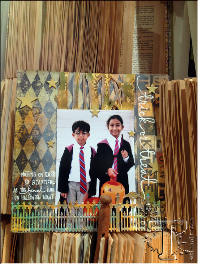
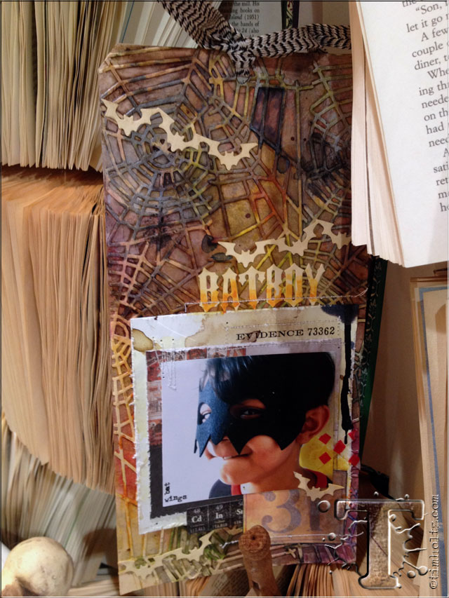
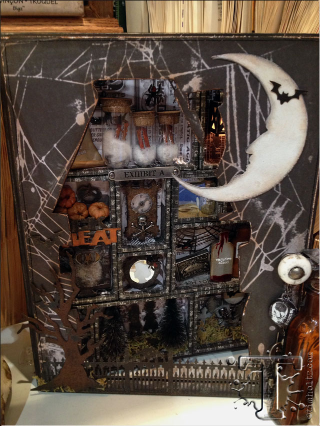
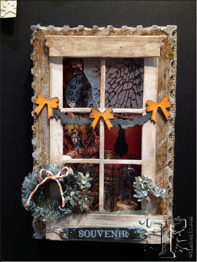
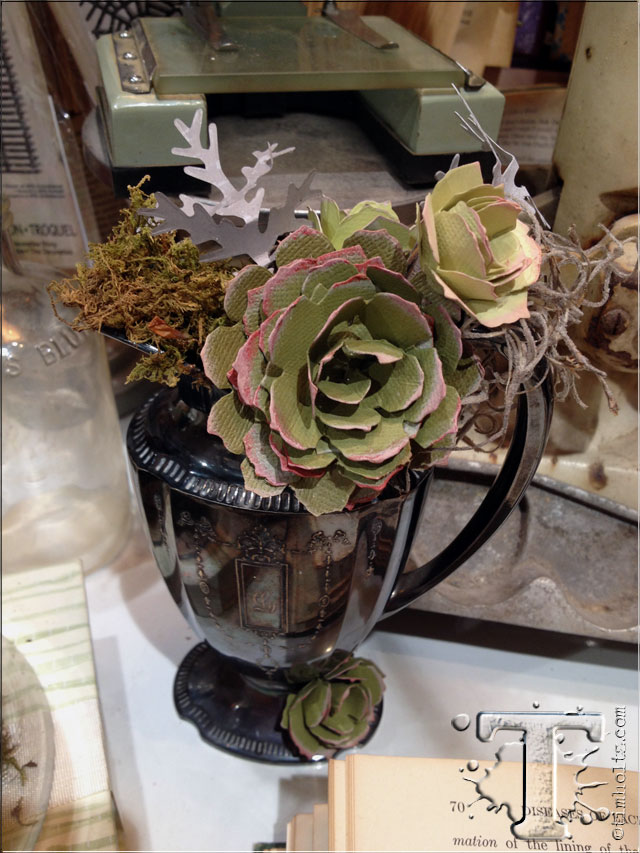
the projects of course were equally as impressive with everything from cards, scrapbook pages, tags, and an awesome configurations book all designed with wonderful fall and halloween themes. check out the great cobweb background on the tag, the cut pieces from the new stamp/die combo set, the dimensional burlap panels, and even the faux succulents created from the tattered pinecone die – genius designers i tell you. (be sure to revisit monday’s post and the links to designers who created these samples as many of them are also posting daily recaps from the show on their blogs)…
thanks again to scrapbook.com for stopping by the booth and taking some great video to capture the look and feel of this display and the projects…
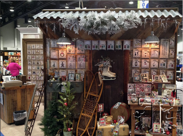
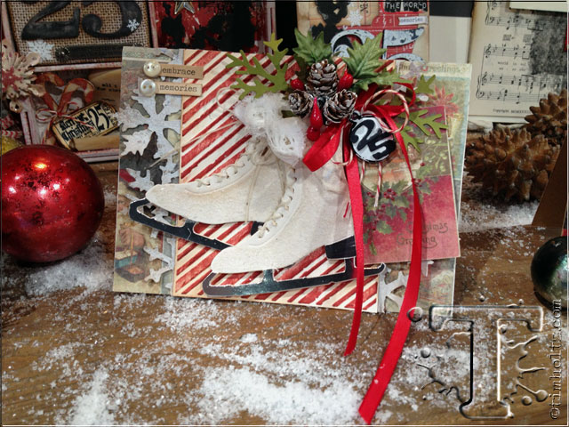
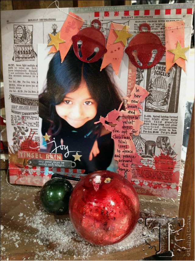
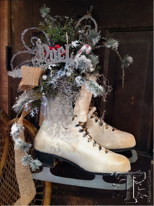
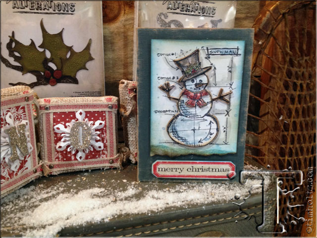
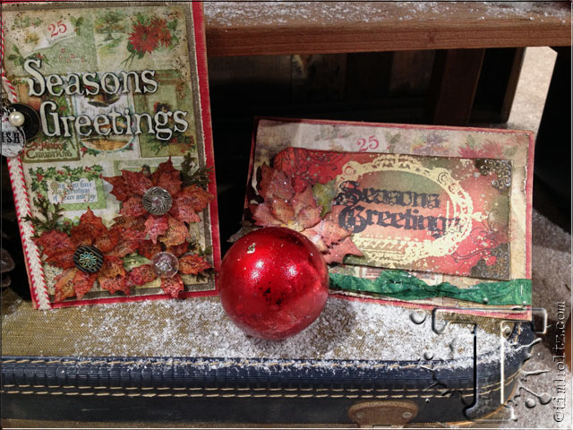
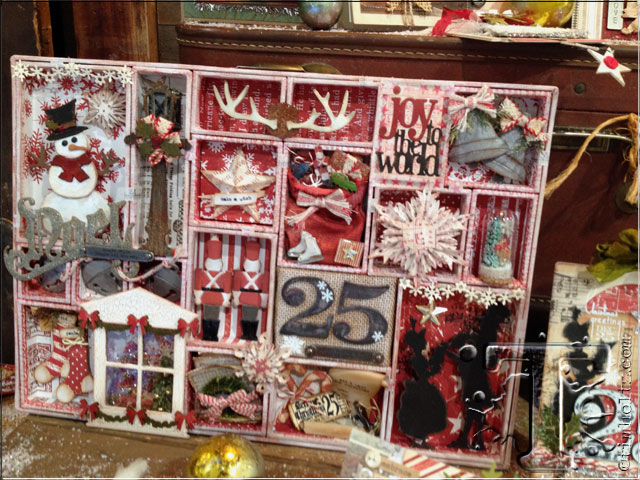
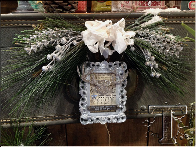
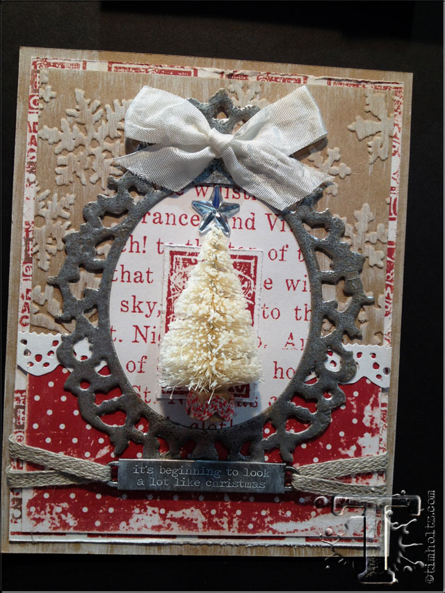
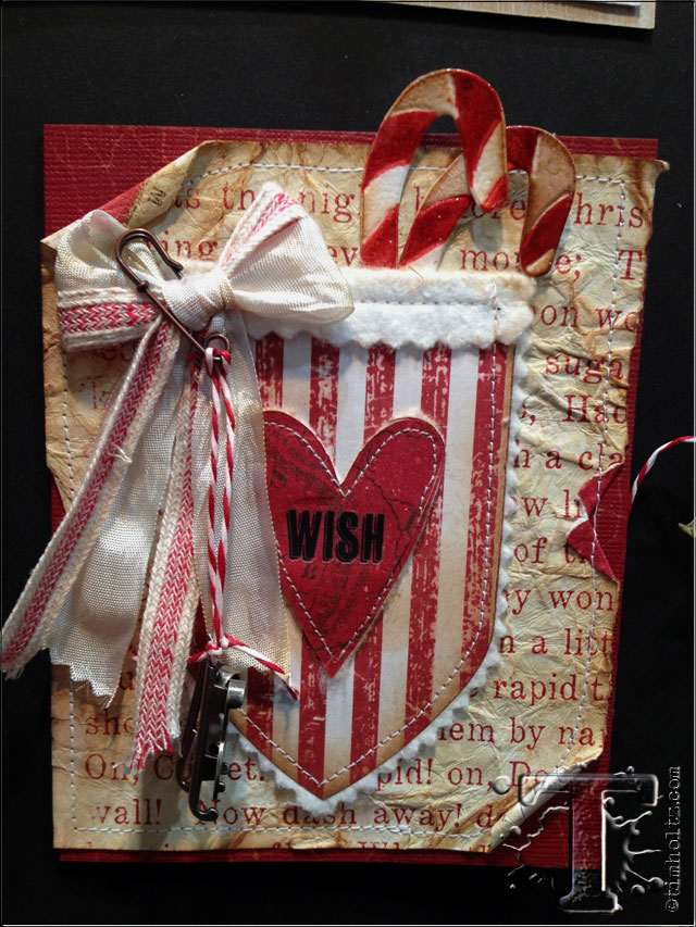
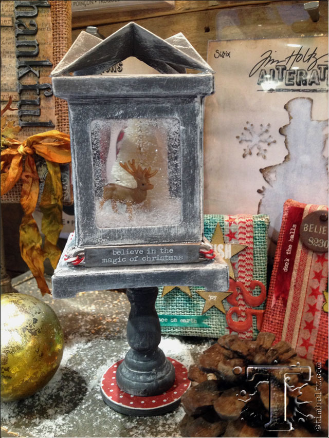
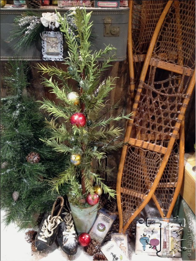
then of course there was definitely a feel of christmas in the air at this booth as debi wowed me again by dusting just about everything with the glistening of frosty snow. i absolutely love how this booth turned out and the samples were so festive and imaginative. i honestly don’t even know where to begin since there were so many projects including cards, scrapbook pages, home decor (love the ice skates), another over the top configurations, and don’t miss the 3D luminary that was turned into a dimensional holiday display . luckily i took close up photos of many of them…
would you believe this tree is made from the tapered fringe die from the last release (i used it as grass on the march tag)? yes, the tapered fringe die cut with card stock and glued to floral wire to create tree branches. this creation was also from the talented debi adams at sizzix – unreal…
once again scrapbook.com captured this wonderment on video for you to experience and enjoy as well…
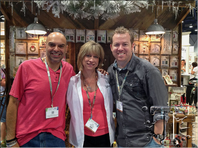
here we are with the creative mastermind behind the alterations displays, samples, and my new creative expert at the show who demoed alterations – debi adams! thank you debi for rendering me speechless so many times by your kindness, generosity, friendship, and sheer artful genius. she really is just a wonderful person and i know many of my team got to meet her for the first time and absolutely agree that she fits right into our crazy bunch…
another debut at the show with sizzix is the collaboration of my stamps made by stampers anonymous and the framelit thin dies made by sizzix. many people asked if the dies would be sold separately, and they will not. the reason is, the stamps in these sets are not the same size as the original images i released with stampers anonymous. these were sized to work specifically with the design specs and requirements for the framelit dies so many of the images are in fact larger than the original ones. as you can imagine, it’s a match made it creative stampers heaven it tell you! check out this demo sara at craft test dummies filmed at the show and see it all for yourself. i have a feeling my holiday cards will never be the same again…
okay, so that wraps up the sizzix recap. i know i could have literally took tons more photos of everything, but like i said, i’m sure many of the designers who created them are sharing more photos on their own blogs so check out monday’s post for the links. be sure to post a comment today as well for your chance to win some of the new product giveaways we’ll be announcing on the blog this friday 8/2. tomorrow is the final recap with idea-ology so take time to be inspired by today…t!m


