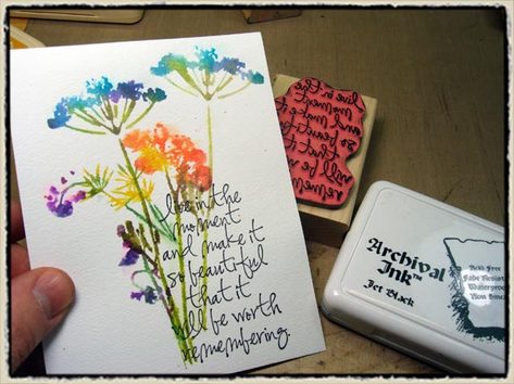
"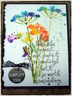 september technique challenge" – tim holtz(c) 2008
supplies: craft sheet, Adirondack Dye Ink Pads, mini mister, archival ink, heat tool (Ranger); stamps (Hero Arts, Stampers Anonymous); watercolor cardstock
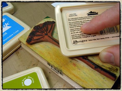
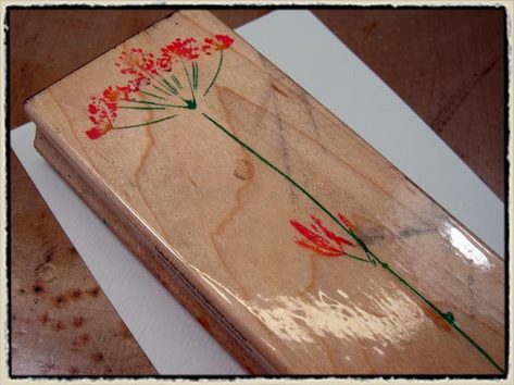
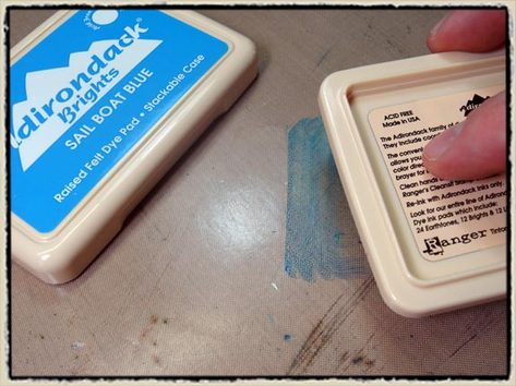
step 1: begin with a stamp image that has a basic "design". what this means is if you are looking at the rubber, you should be able to identify the image. this technique is not that great with stamps that have too much detail or faces as the watercolor effect blurs the design somewhat. working with Adirondack Dye Inks, begin inking various areas of your stamp using the corner of the stamp pad only *tip: do not ink the entire image the same color.
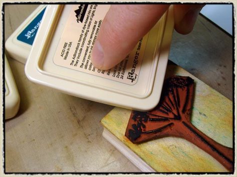
step 2: repeat with additional colors inking up all of the areas with the appropriate colors you choose *tip: it’s a good idea to work light to dark color-wise to avoid marking up your ink pads – not to worry though, you CANNOT contaminate your ink pads with this technique. the amount of ink applied to the stamp is too minimal.
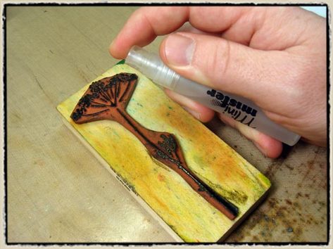
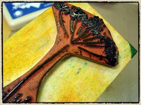
step 3: once entire stamp is inked to your liking, place the image flat on the table *tip: do not hold the stamp upright – it must be flat at this point. mist the inked stamp with water from mini mister until entire design has droplets of water on it.
step 4: this is definitely where practice makes perfect. i tend to use more water in this technique as i like the look of watered color – remember we are going for a brushless watercolor look. the ingredients are simple – water +color.
step 5: stamp your wet image on to water color paper *tip: i use watercolor paper because it is designed for water and ink. the little pits in the paper work as ink wells and allow colors to pool up creating great effects.
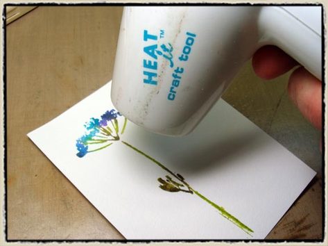
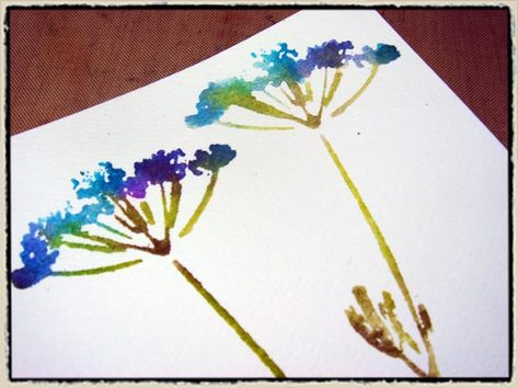
step 6: immediately lift the stamp off of the paper and dry with a heat tool *tip: may people hold the stamp on the paper too long during this step. you should just stamp and lift to avoid the ink from soaking into the paper. be sure to dry the wet image with a heat tool (even if you don’t like it at first) – it really changes when it’s dry – trust me!
step 7: if you want a second generation of that image you can simply re-mist it, stamp, and dry it again *tip: usually you can get 2-3 additional images form the same initial inking as the Adirondack Ink pads have excellent color concentration.
step 8: repeat with additional images if desired *tip: don’t worry about smearing your already stamped images, they will be fine if you stamp another wet image over them.
step 9: stamp text over your watercolored images with a waterproof black ink – this will show the sharpest and with the most contrast to your design.
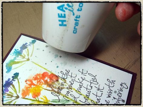
*BONUS TECHNIQUE: if you would like to add a bit of "imperfection" to your watercolor, try creating some splatters to your finished work – here’s how…
step 1: apply Adirondack Dye Ink directly to non-stick craft sheet.
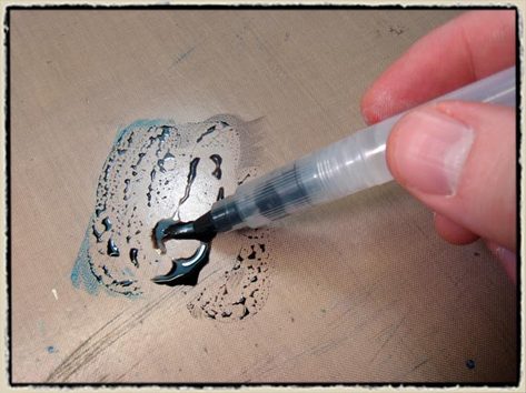
step 2: using a waterbrush, dilute ink on to craft sheet with water from brush until you get it very wet and "soupy".
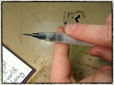
step 3: stick out your index finger and tap the inked brush against your finger creating splatters on to your finished card. (repeat until look is achieved).
step 4: dry splatters with heat tool.
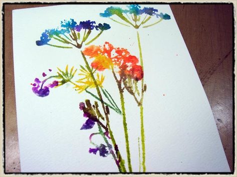
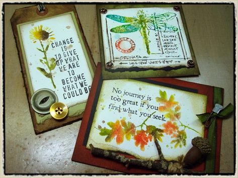
so get out those Adirondack Dye Inks that you probably haven’t used for a while. grab a few stamps to play around with and get a BIG stack of watercolor paper – you’re gonna need it (this technique is addicting). i like this technique for nature stamps especially – it’s a great way to blend ink colors for leaves, flowers, etc. (but they also work great on artistic stamps too…) here are a few more samples to get you going.
