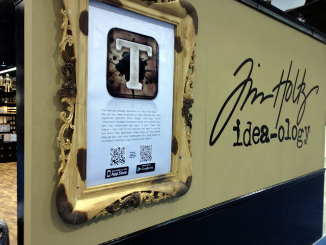
 hello again bloggers! hope you had a great weekend. i spent mine getting things unpacked, put away, and reorganized – such a great feeling. today i wanted to share more of my cha show experience with photos of my idea-ology booth. with the help of paula, debbie, mario, sarah(and the rest of team advantus) we set out to create the look and feel of french industrial complete with luggage, lighting, ladders, hats, and a variety of other oddities to use as props. it’s funny that when we’re setting up the booth, it look like an episode of american pickers – i love it!
so today’s post is a long one filled with photos and even a video tour of the idea-ology booth. i also can’t wait to share the many incredible projects made by some of the most talented designers i’ve seen. i thank each and everyone of them for sharing their creativity and making this show one of the best yet. i hope you enjoy…
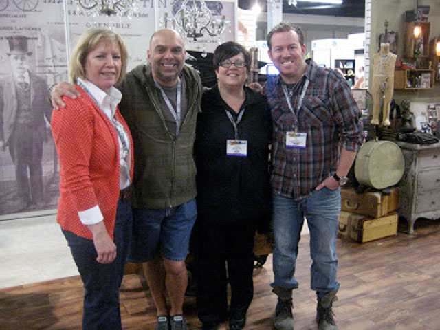 so here is my team: debbie, mario, paula (seriously i couldn’t do what i do without them – thanks guys!)
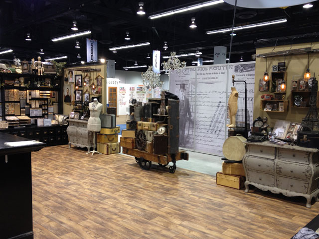 the look and feel of the idea-ology booth is important to tell a story. with the launch of the french industrial line we combined elements of travel with accents of industrious all with a french flair. here is a look at the overall booth (not bad for the floor of a convention center huh?)
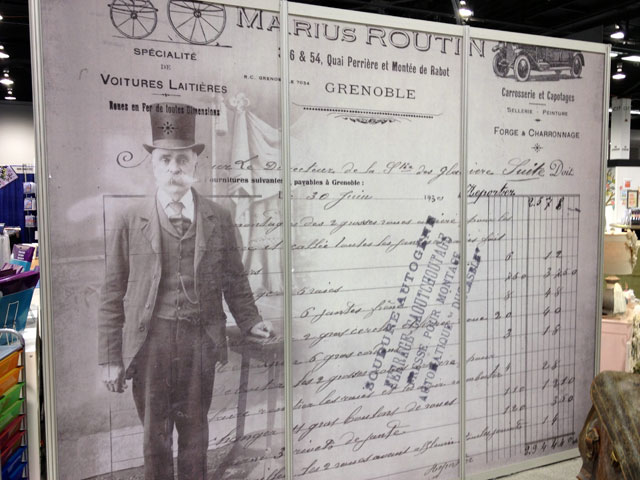 we loved this idea of taking one of the new papers, blowing it up huge to fill this back wall in the booth. it’s incredible how it turned out.
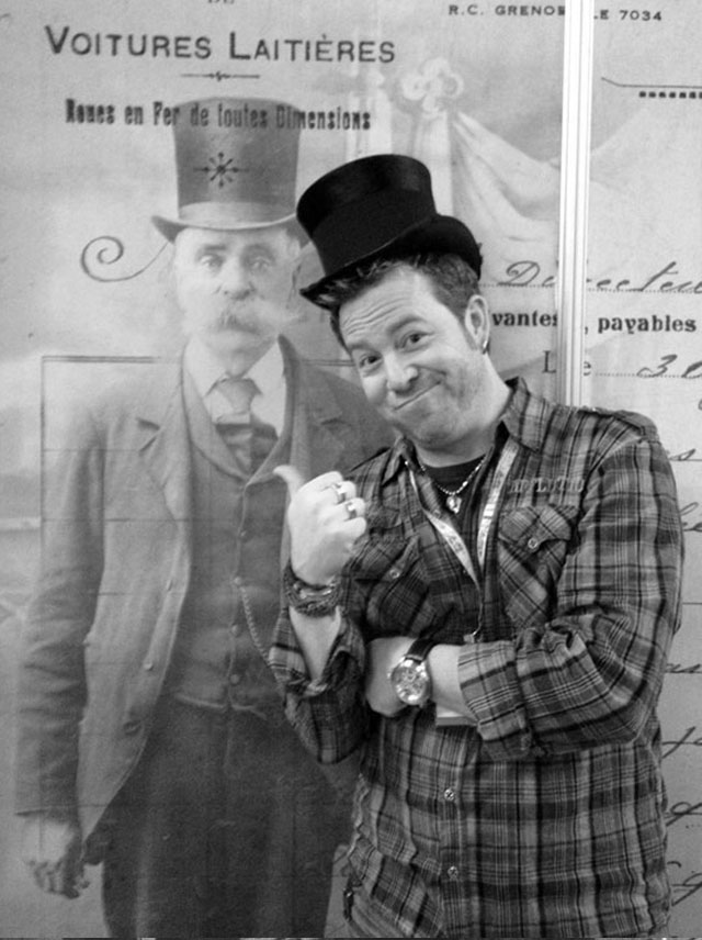
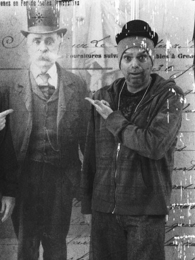 of course we couldn’t help but take a few photos with the now infamous “moustache man”.
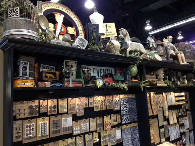 i love the collection of found objects that accent the tops of the fixtures that display all of the idea-ology product.
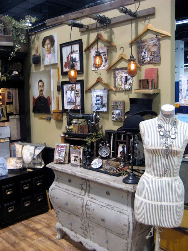
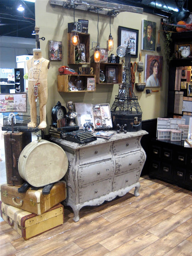 i think the displays we created to show off samples in the booth turned out awesome. the vintage boxes hung over the dressers decorated with an old sewing machine, hat stands, vintage dress forms, and some luggage – it’s great to display all of the projects. check out the lighting with the edison bulbs strung on cut up old ladders that paula actually picked up for free on the side of the road – way to go paula.
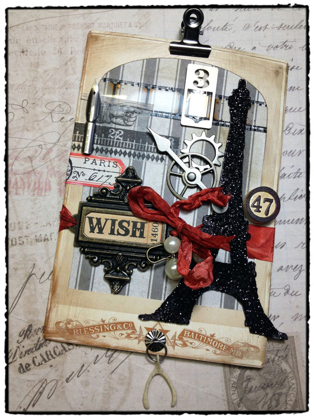
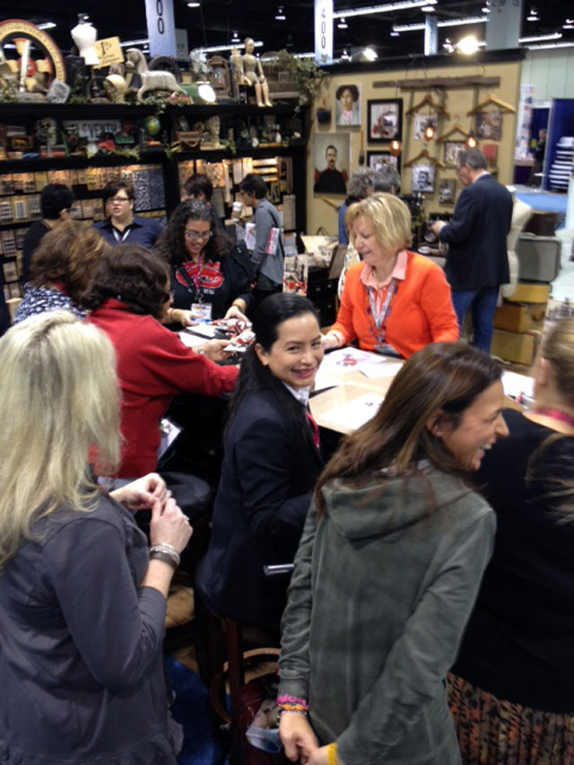 the make & take we did in idea-ology at the show created lots of excitement. debbie worked daily to teach this project to over 250 people throughout the show – bravo! this mini project shows the new paper, eiffel tower die, and lots of new idea-ology goods.
next up are the project samples, and there were so many great samples. paula headed this team of designers who shared their talents to create stunning projects for all of my booths at cha including idea-ology. if you’re interested in seeing more of their work (just click the name to visit their blogs)…
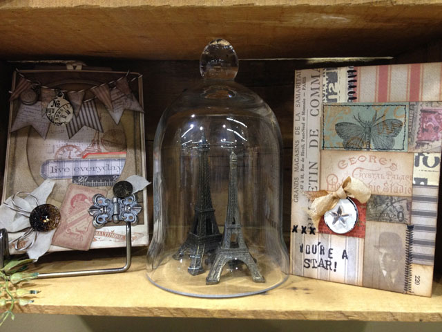 here are a couple of cards showcasing some of the new papers. (left: chelle fowler/right: sande krieger)
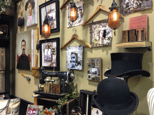 these layouts were displayed on vintage hangers which gave them a great look as a collection (lynn thune)
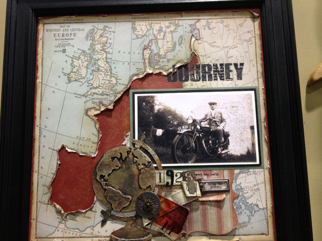 another great layout from (jan hobbins) shows a cool torn paper element we thought was beyond clever.
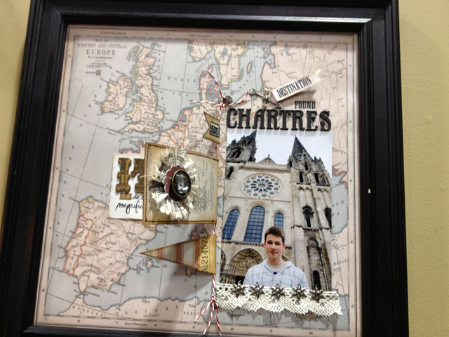 this next layout from the “oh so detail oriented” (sande krieger) was one of my faves with her use of paper string.
the new burlap panels also created lots of excitement and with these creative samples you can see why…
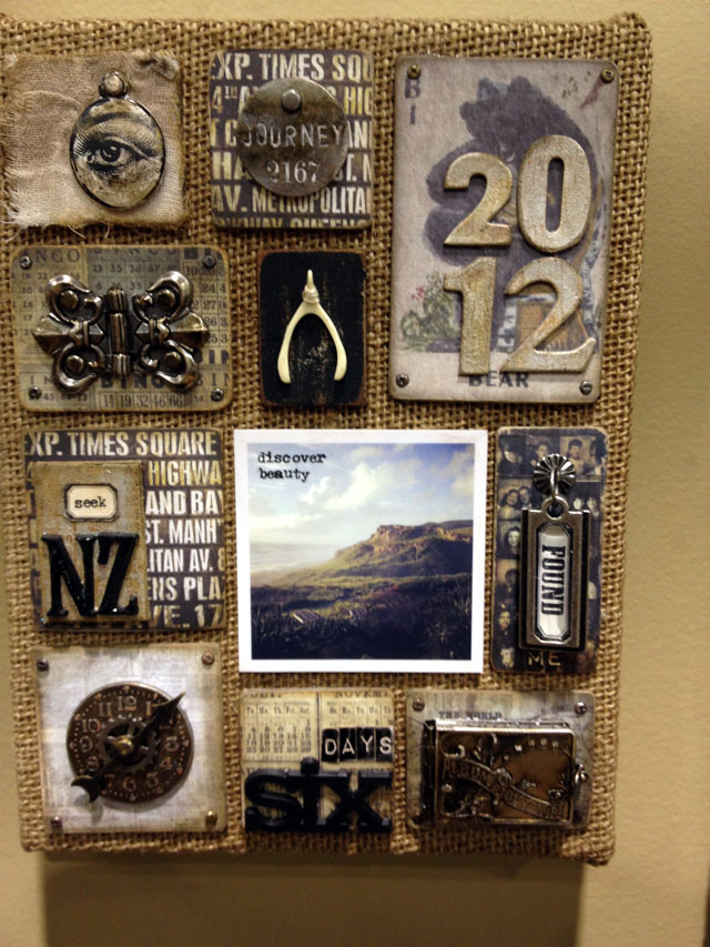 first up is (paula cheney) who created tiled elements and used some of the new idea-ology trinkets, so awesome.
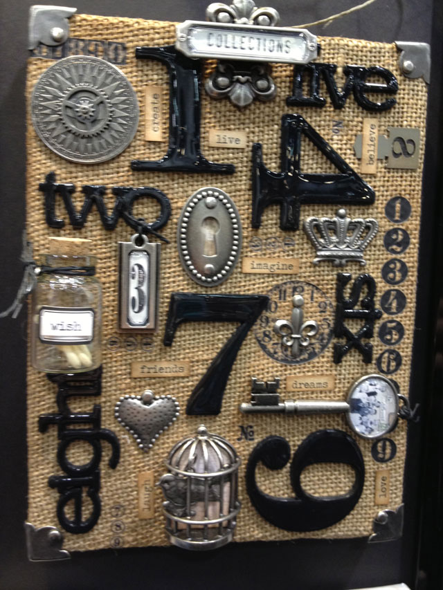 (richele christensen) created an artful panel using idea-ology stuff too. love the use of the rub-ons directly on the burlap as well as the new numeric alpha parts coated with glossy accents.
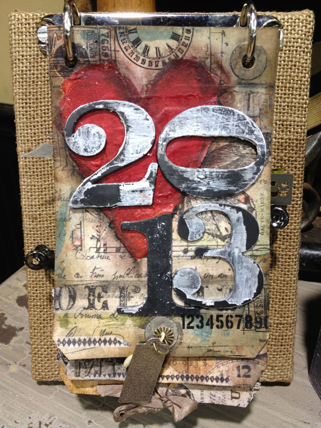 this idea to turn a burlap panel into a tag calendar is the idea from (stephanie ackerman) using one of the idea-ology ring binders too.
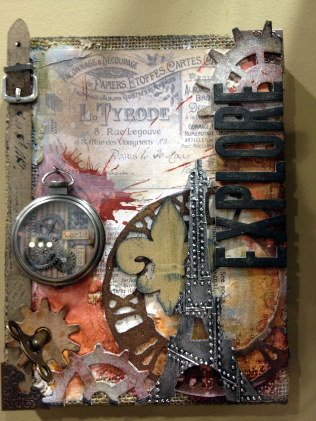 i took a more mixed media approach on mine and layered the burlap with papers, grunge, and or course some distress stains and the new distress paints.
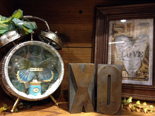
 these beautiful jewelry samples were also a great addition to the idea-ology booth this show thanks to the talents of (connie fong). the elements used to create these wearable pieces definitely give a new perspective on idea-ology.
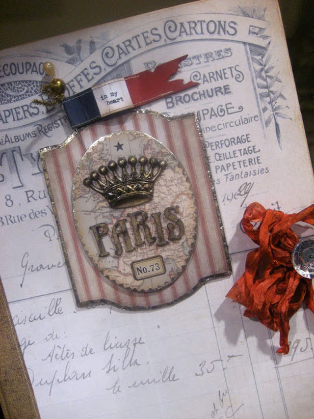
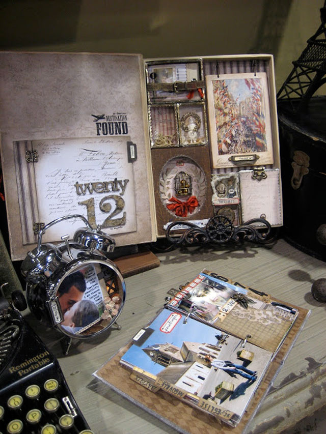 another favorite project of mine was this new configurations book made by (paula cheney). so many details in this project, the photos do not do this one justice. *there is also a glimpse of the assemblage clock i made along with the fantastic worn cover journal from (sande krieger)
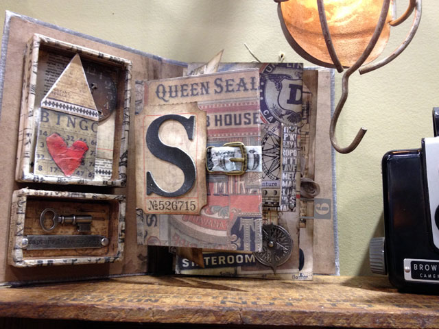 check out this clever use of configurations inserts inside one of the new worn covers from (stephanie ackerman) making this book truly multi-dimensional.
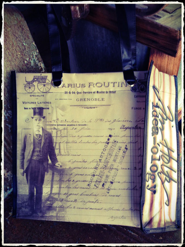
well if you’ve gotten through this entire post, i hope your mind is racing from creative overload. i know not everyone has the opportunity to attend cha which is why i want to share my recaps with you so you can be inspired by everything from the show as well. in fact, we want to share a little something from the idea-ology booth that was our booth giveaway this show. we gave away over 1000 of these bags at the show to a frenzy of people every morning, and since these awesome bags are not for sale, the only way to get one is to win one. so post a comment sharing your favorite idea-ology release (or releases) for this show and we’ll pick random winners to announce on wednesday when i recap the sizzix booth. good luck everyone…t!m
